CASE
The construction industry is changing. The market requires bigger, stronger, safer and faster means to optimize speed and efficiency during the building process. RAXTAR is committed to making customers' vertical logistics more efficient. What started as a passenger and material hoist rental company, ANC grew into two companies, where construction hoists are produced under the name RAXTAR. RAXTAR is best known for exceptional construction hoists, tailor-made for complex high-rise projects and skyscrapers in New York, among others.
But they also develop standard construction hoists in smaller series. These are less known. RAXTAR wants to change that. Two companies and two names. Wouldn't it be better to continue growing under one name? And how do we ensure more familiarity with our standard series? They asked Megawatt Advertising. RAXTAR, let's level up.
APPROACH
We started with a rebranding process and got to a strong positioning statement through strategic sessions. Our advice: integrate ANC and RAXTAR into one brand. Why? Because the knowledge and experience they have in house is at least as important as the products. Most knowledge and experience is in the rental company (ANC). They gain valuable knowledge by developing exceptional construction hoists. They then translate this knowledge in the development of their standard construction hoists. In this way they continue to make the base smarter and optimize it.


RESULTS
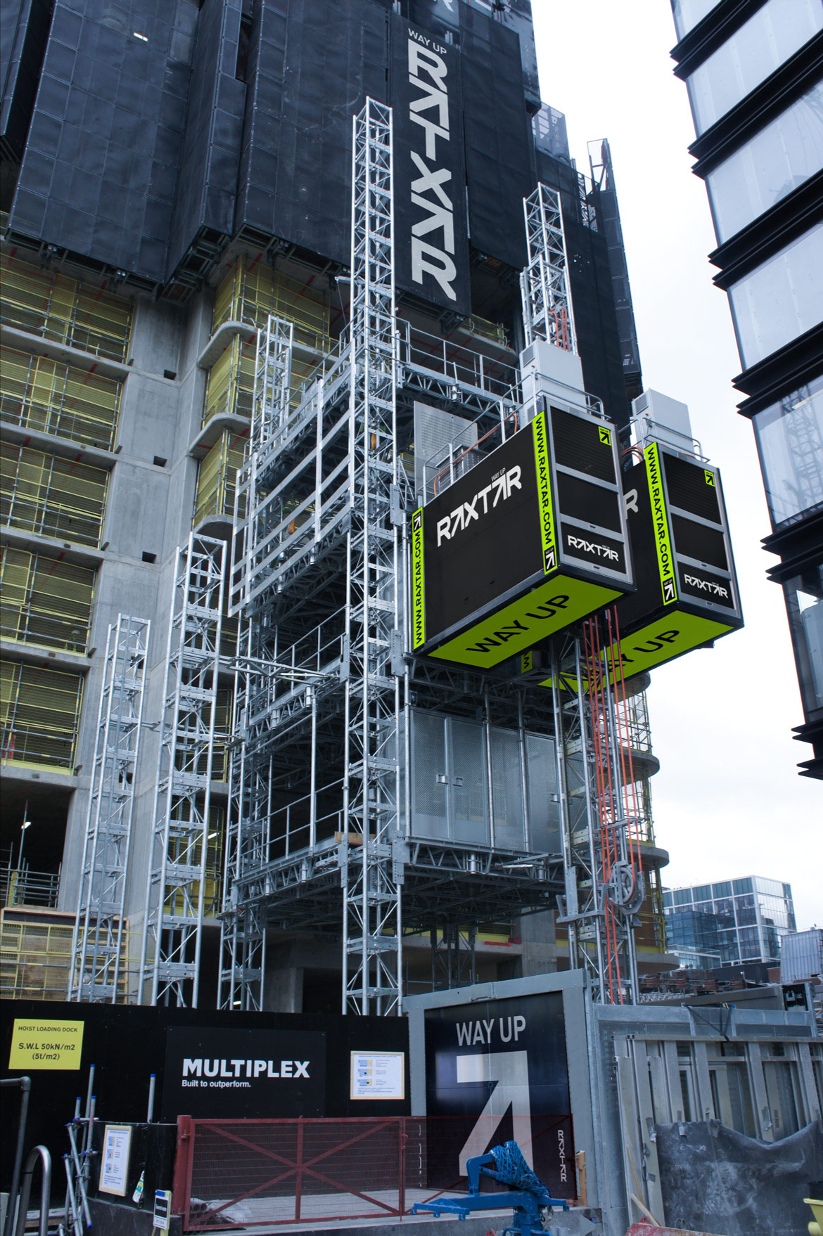
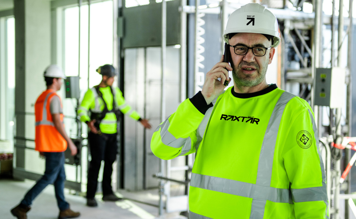
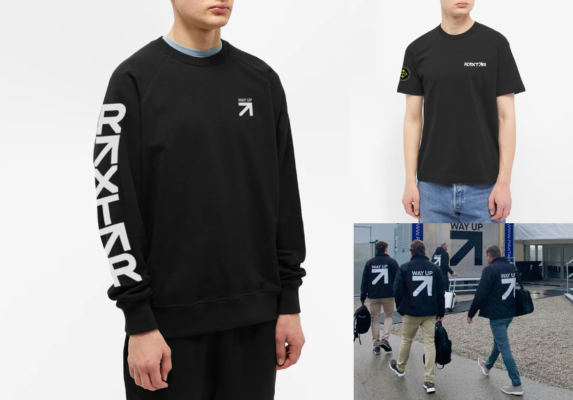
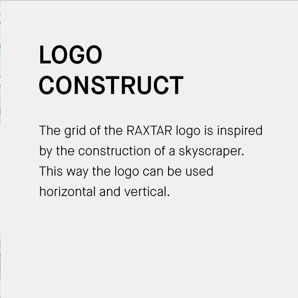
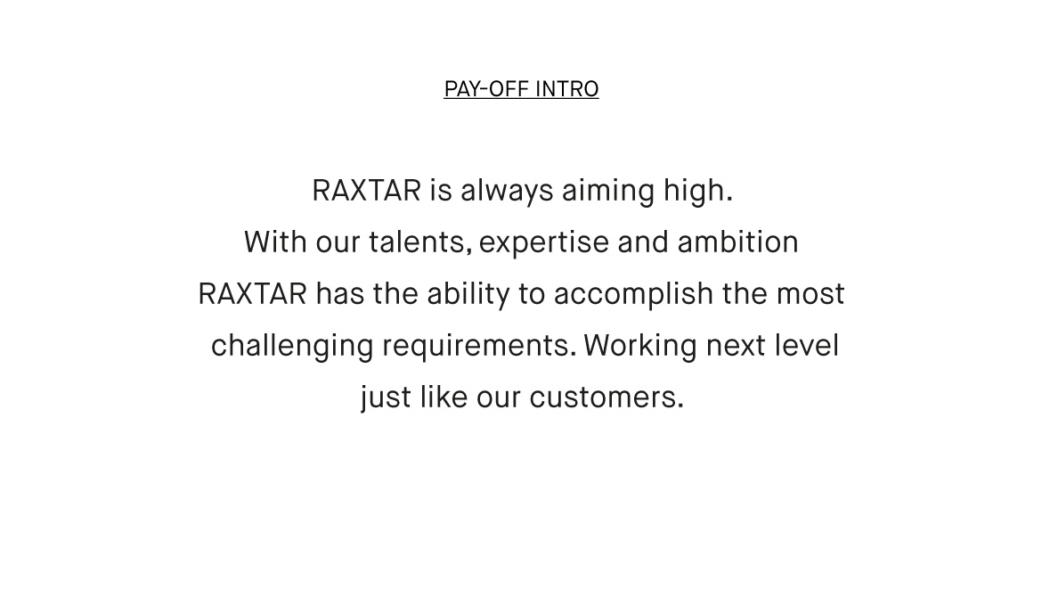
By merging ANC and RAXTAR, we came to a powerful brand story, where not only the products, but also the knowledge and experience they have in house, come into their own. Also, in the visual identity. Because where the pay-off 'Way-Up' literally means going up, it’s also about having fun and being 'on top of your game'. This fits perfectly with the energy of RAXTAR. In addition, we have put ‘moving up’ throughout the whole visual identity, with a wink. Think of the website that is built vertically first and the A's in the logos are in the form of arrows. Because in vertical access it's all about uptime.